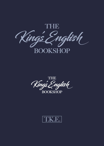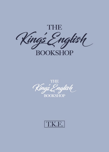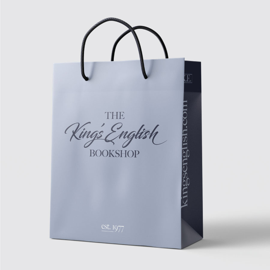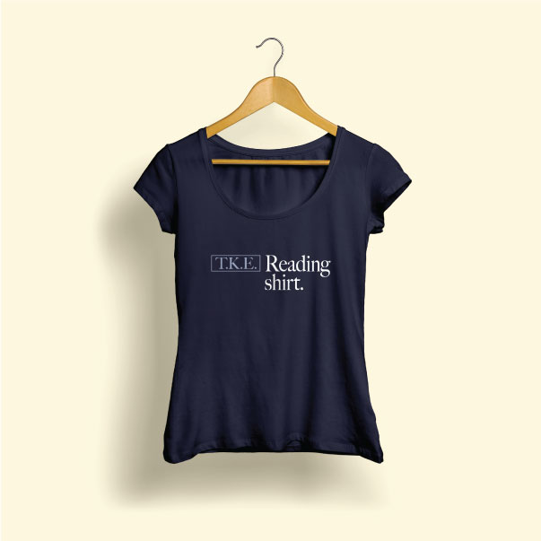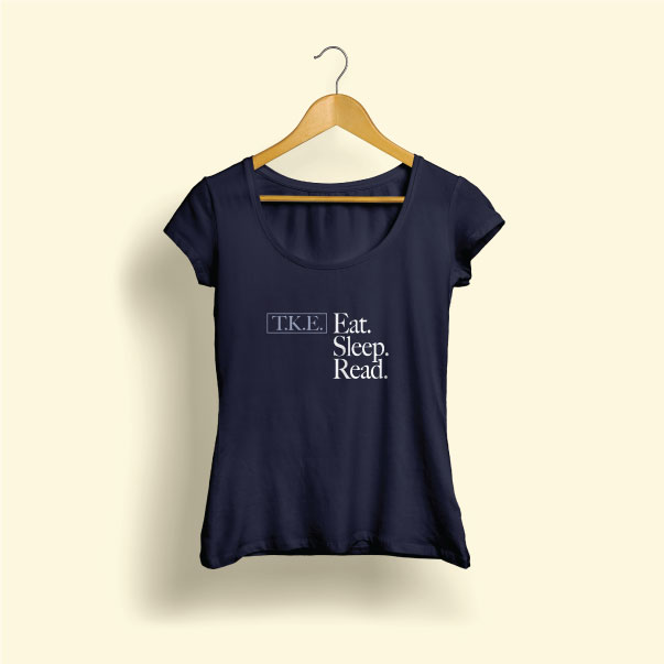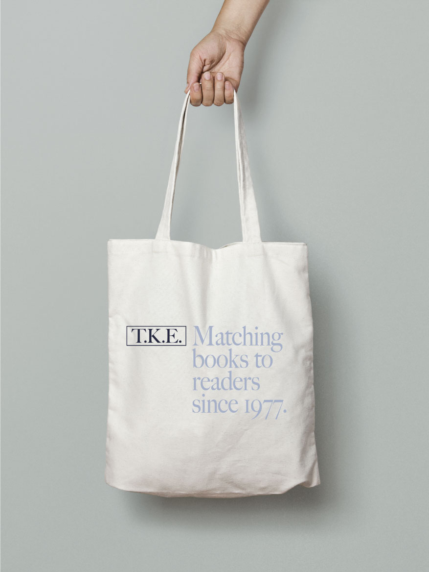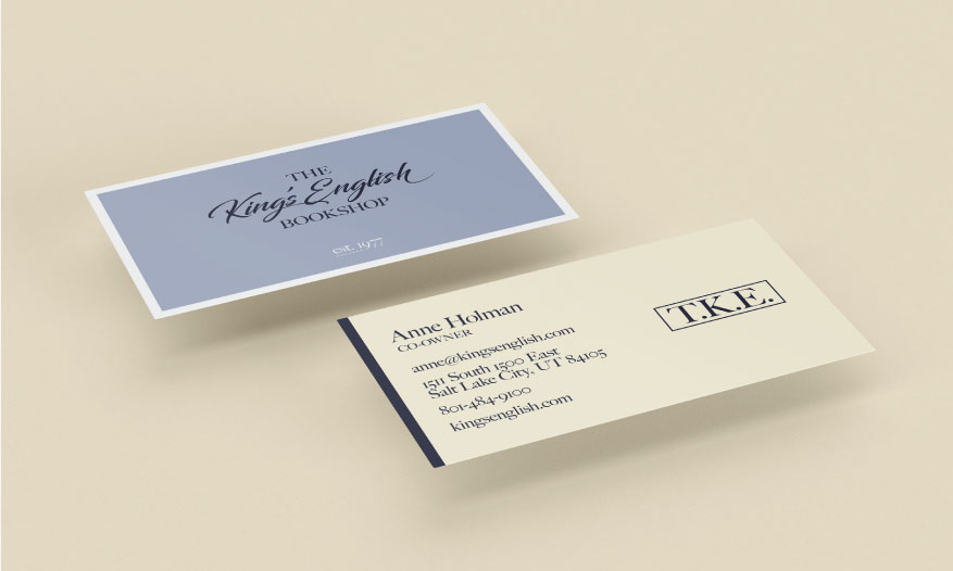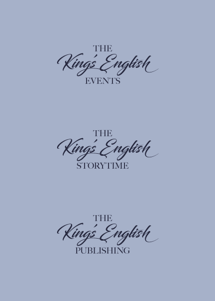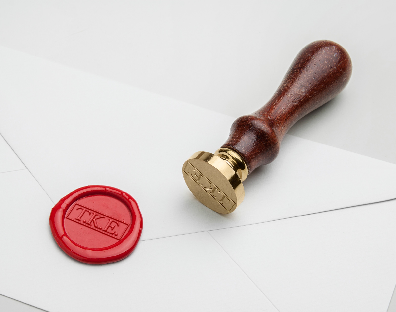


Reworking the visual brand of a Salt Lake institution is always a tricky business. A combination of traditional English typography, colors pulled from well known storefront, and just enough attitude to keep things just a little sassy. To add to the main wordmark, a monogram is provided using the “TKE” shorthand for the store, additional variations exist for services and special events as needed.